Some creatives of domestic advertisers are no less funny than funniest names and surnames... And some raise only one question: "Why did you create this?"
We must warn you: this collection of the most stupid and funniest Russian ads can give you a facepalm. Many times.
The article used images posted in the public domain on the Web.
30. Advertising of the Barnaul crematorium
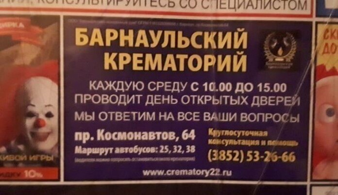 It's hard to say what scares you more: the smiling clown on the side (although it is from another advertisement) or the words about "open day". This ad is a prime example of a "bad combo" where both placement and copy are bad.
29. Burger King Advertising
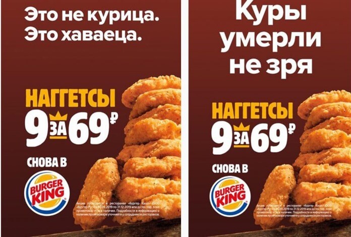 Perhaps not in vain, but somehow I don't want to check. And you?
28. Advertising "Pyaterochka"
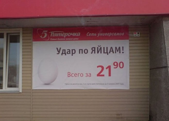 Quite a provocative inscription, from which many impressionable men involuntarily squeeze their hearts.
27. Advertising of the company "Kamcha"
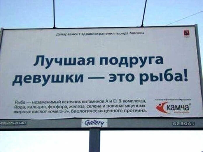 In one song we were assured that a girl's best friend is diamonds. But the marketing specialists of the Kamcha fish trade company have a different opinion. Which option you prefer (or none of them suits) - choose for yourself.
26. Street advertising
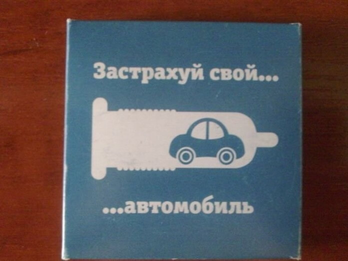 The message is clear, but the execution is lame. Perhaps the advertiser had little time, and of all the variants of associations to the word "insurance" he chose the most unpretentious one.
25. Honest advertising
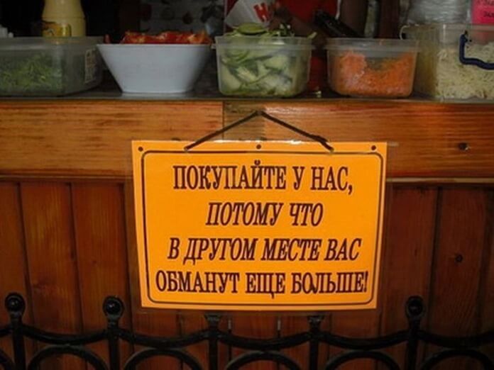 Oddly enough, this funny Russian advertisement even stimulates people to buy. After all, buyers in our country are used to cheating by sellers. For example, to the fact that on "Black Friday" prices in many stores go up, not go down, and behind the crossed out price tags there are other price tags, on which the price was initially even lower.
24. Social advertising
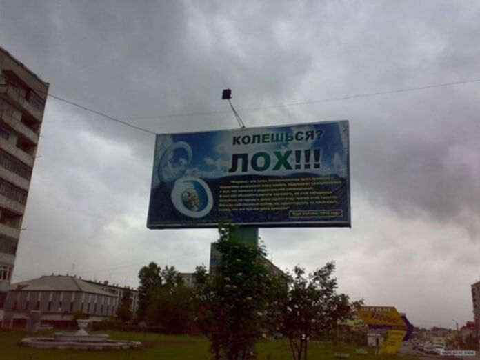 Advertising posters as a counter to the spread of drug addiction in Russia are undoubtedly a necessary thing. But in this case, the inscription “Are you injecting? Loch !!! " will be the only thing you can consider. Because all other useful information is typed in small yellow print, apparently for people with eagle vision.
23. Dental advertising
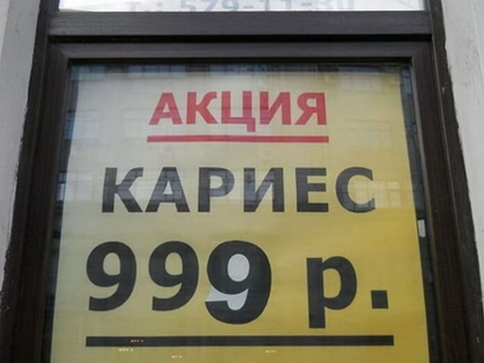 Can I have another dentist?
22. Advertising gel "Duru"
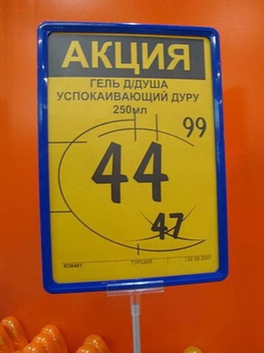 I wonder who thought of writing the name of the brand "Duru", which is funny for the Russian ear, in lowercase letters in this advertisement? And what if this someone really meant the sedative effect of the drug on the (not very smart) woman? In this case, it would be interesting to look at the course of the tests.
21. Advertising "Cafe at Alexei"
 There is only one question left: where is the cafe "UANATOLIA"?
20. Advertising taxi "Lucky"
 At first glance, this is an ordinary advertisement. But if you look closely, a lot of money no longer seems so tempting.
19. Advertising of road transport
 Is it too expensive to ship it or if it is too expensive? And in order for this ad to read correctly, all you had to do was to abandon the wrong hyphenation.
18. Cafe advertising
 Another example of misplaced words in an ad message. As a result, we get a sad text with a self-destructive meaning.
17. Advertising of concrete
 Luxury concrete, crocodile leather construction helmet, and custom work gloves. What else do you need to build quality houses in Russia?
16. Advertising from the developer
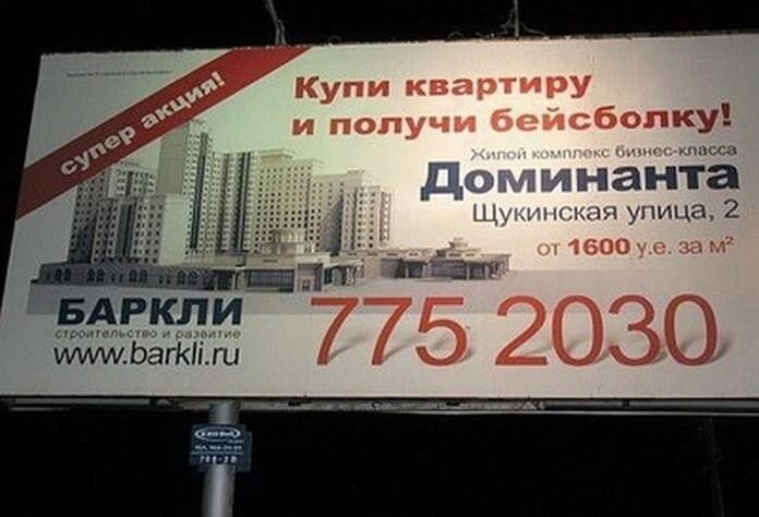 Is it possible the other way around?
15. Shop advertising
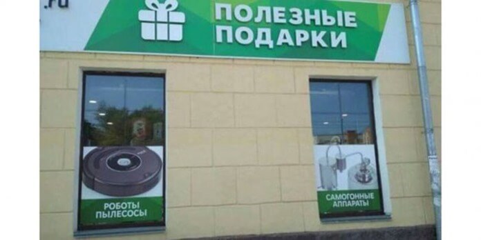 A very difficult choice if there is no money for both gifts at once.
14. Social advertising
 Call wherever you want. We won't write our phone number.
13. Political advertising
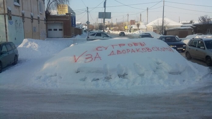 Such "voting" drifts appeared in 2017 in Omsk. Moreover, the paint was quickly removed from them, but the drifts themselves remained. Residents of Novosibirsk were more fortunate, after a similar action both paint and snow were promptly removed there.
12. Advertising of a hairdressing salon
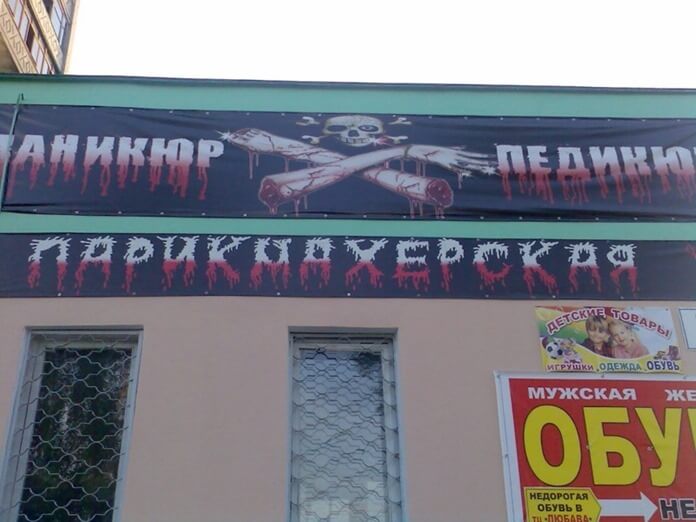 If you are planning to invite the Adams family to your establishment, then this ad is very good. But it is more likely to scare ordinary people away.
11. Advertising of a furniture store
 Another example of how you can spoil any ad with bad placement. It is unlikely that its creators assumed that the number "73" would be perceived as the number of injured veterans.
10. Advertising "two in one"
 Apparently, the "old" builders are quickly coming to an end.
9. Advertising from the developer
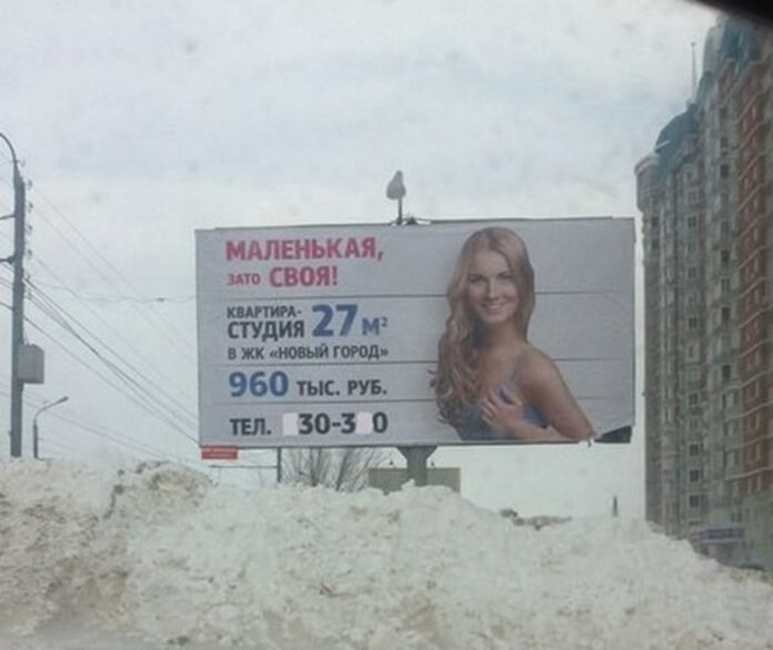 And the creative potential of our marketer is small.
8. Advertising from the developer
 And one more contender for the worst advertising in Russia. Yes, pretty girls, even in bee costumes, attract attention. But it is unlikely that the "sorry" sticking out from under the skirt will inspire potential buyers of apartments to buy.
7. Food advertising
 I'm already flying!
6. Food advertising
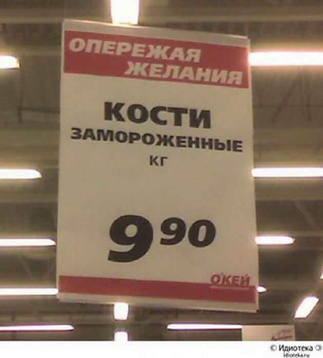 Desires so quickly outstripped that the wind blew away all the meat from them, leaving only bones?
5. Advertising of a clothing and footwear store
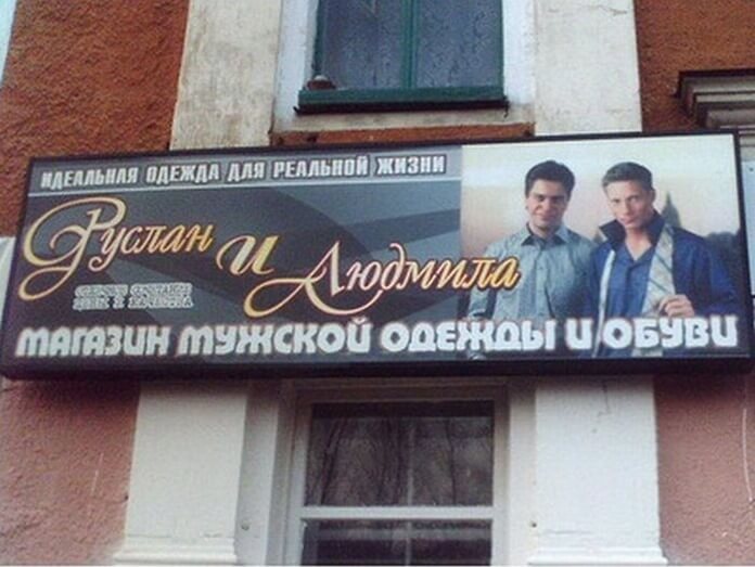 Which of these two is Lyudmila, and why did the parents make such a cruel joke on their son, giving him a female name?
4. Turkish Airlines Advertising
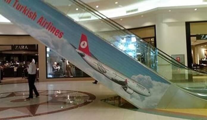 An airplane flying not up, but down is a nightmare of any passenger of air transport. The advertiser has done Turkish Airlines a disservice.
3. Social advertising
 The case when the designer did not even pretend that he was trying.
2. Shop advertising
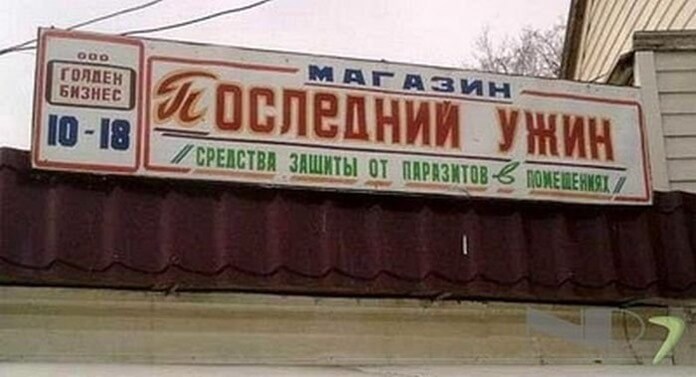 Not a bad example of advertising black humor.
1. Social advertising
 Immediately I recall the response of the townspeople to the appeal of the Samara governor to decide on motherhood early. According to Dmitry Azarov, due to the fact that the residents of the region are late in deciding to have their first child, not everyone has time to give birth to their second and third children. “You need to - you and give birth,” - said the residents of Samara.
The same can be said for the authors of this advertisement. After all, there is nothing more stupid than calling for childbirth for the sake of mythical "records".

